Volcano Plot
Curtain generate volcano plot for both total proteomics and PTM proteomics differential analysis with the column input as parameters for the x (log2 fold change) and y axis (-log10 significance). The plot is interactive and can be zoomed in and out and the data points can be hovered over to see the primary id and the log2 fold change and -log10 significance values. If UniProt id is supplied as primary id, it will also display the associated gene name.
By default, the plot will be generated with log2 fold change cutoff at 0.06 and significance cutoff at 0.05 or -log10(0.05) = 1.3.
The Plot
The volcano plot above displays differential analysis from published total proteomics data. In the plot, we selected a set of protein from the LRRK2 Pathway and combined them as a selection group in light orange color. The protein PPM1H was selected as a singular data point in dark purple color.
Beyond that, with the default color scheme, different colors were assigned for each of the different categories of data value with different fold change and significance cutoff.
Basic Settings
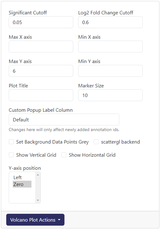
The above is readily accessible cutoff and axis settings for volcano plot.
Significant Cutoff: The cutoff for significance value (before -log10 transformed). The default is 0.05.
Log2 Fold Change Cutoff: The cutoff for log2 fold change value. The default is 0.06.
Max X axis: The maximum value for the x axis. The default is the highest possible log2 fold change.
Min X axis: The minimum value for the x axis. The default is the lowest possible log2 fold change.
Max Y axis: The maximum value for the y axis. The default is the highest possible -log10 significance.
Min Y axis: The minimum value for the y axis. The default is 0.
Plot Title: Adding a title to the top of the plot. The default is blank.
Marker Size: The size of the data point marker. The default is 10.
Custom Popup Label Column: The column name that has value use to replace the hover template when mousing over a data point in the volcano plot.
Set Background Data Points Grey: If ticked, all non-selected data will be greyed out.
scattergl backend: If ticked, the plot will be generated using the webgl backend (currently buggy)
Show Vertical Grid: If ticked, vertical grid will be shown.
Show Horizontal Grid: If ticked, horizontal grid will be shown.
Y-axis position: Where the y-axis line will be drawn. The default is at position
Zero.
After adjusting any of these settings, you can update the plot by click Volcano Plot Actions-> Redraw Plot
Perseus Cutoff Curve
Perseus does not generate a linear cutoff curve for significance value and log2 fold change. If you want to import that curve shape into plot, you can do so by clicking Volcano Plot Actions-> Custom FDR Curve. This will show a prompt where you can paste in the curve data from Perseus. Note that the cutoff coloring will not follow the curve.
Custom Color Legend
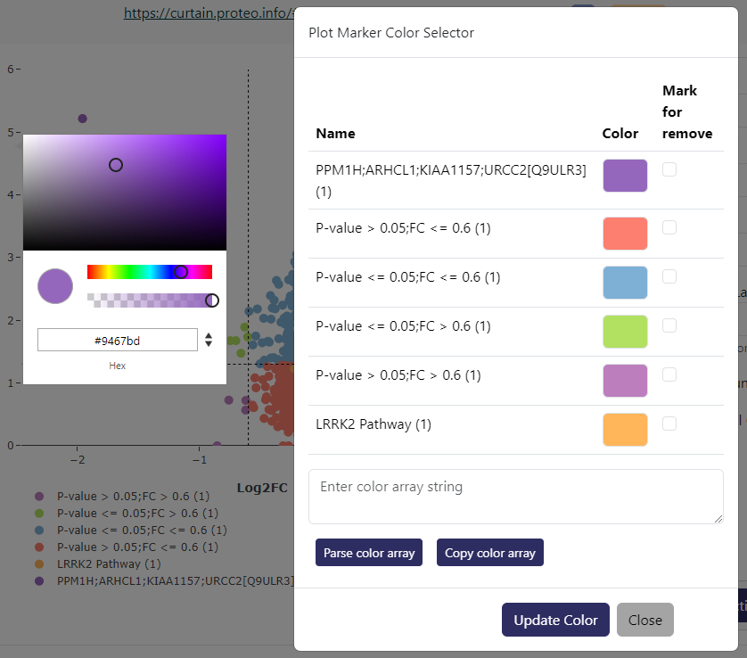
If you want to customize the color legend, you can do so by clicking Volcano Plot Actions-> Custom Color Legend. This will show a prompt as above where you can click on each color and be provided with a color picker. If you check Mark for remove on any particular color legend, that color will be reverted to the default color within the color scheme.
If you want to copy a particular color legend sets from one curtain session to another, you can do so by clicking Copy color array button. This will copy a JSON string containing the titles of the legend and the associated colors in hex values. You can then paste this JSON string into the Custom Color Legend prompt in another curtain session and click Parse color array to apply the color legend. Only legend with the same title will have the color applied. You can manually edit the title within the JSON string in the textbox if the title does not exactly match.
Data Annotations
If you want to annotate a particular data point (showing its label with an arrow pointing to the data point), the data first will need to be selected. For total proteomics data, you can browse down to the protein card and sample data associated to the selected protein and check the Annotate on volcano plot box at the bottom of the card (example below).
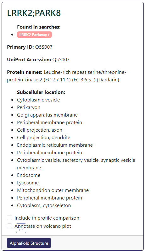
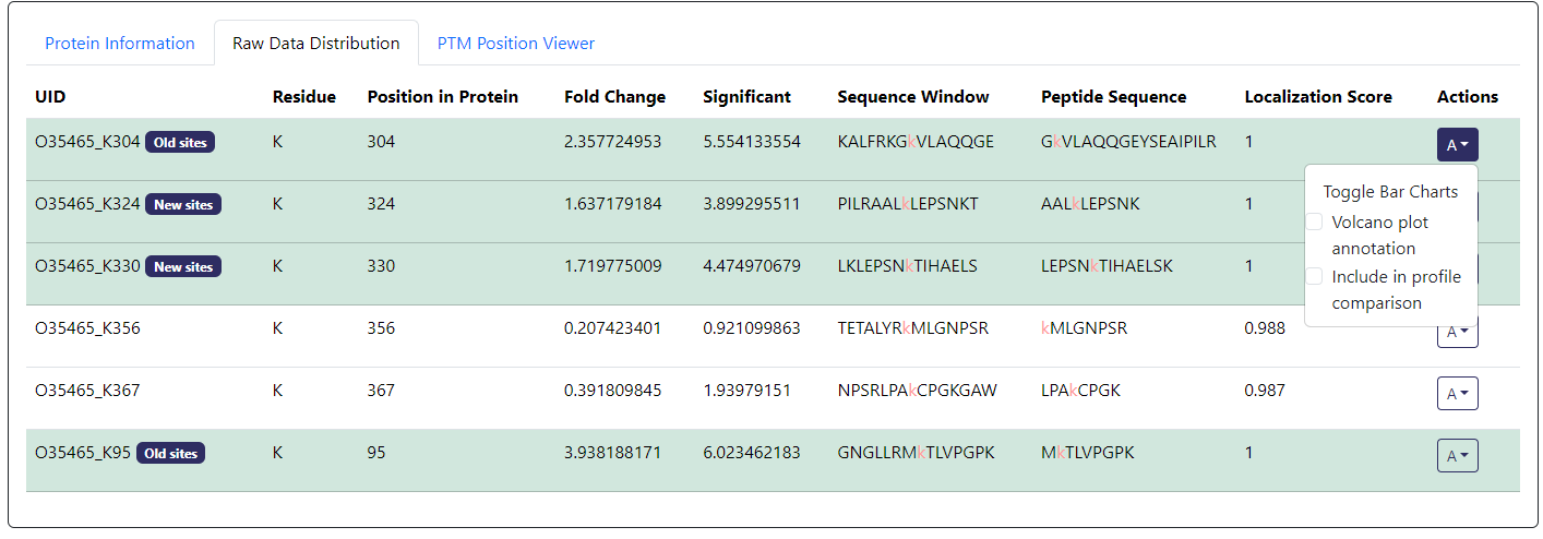
For PTM proteomics data, you will also need to browse down to the PTM data. Here, you can click on the A button under Actions column of the PTM you want to annotate. Then check the Volcano plot annotation box (example below).
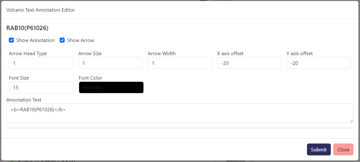
From Volcano Plot Actions-> Annotation Text Editor, you can edit text in term of color, font size, position offset from the data point, arrow size, and the text itself.
